BRAND GUIDELINES
Building the Future,
One App at a Time
A comprehensive guide to the visual identity and brand language of badAPP.
Explore GuidelinesOur Identity
The badAPP Brand Story
badAPP is an AI-first app development company that builds intelligent, beautifully crafted applications. Our brand reflects our philosophy: bold innovation wrapped in radical simplicity.
AI-First
Every product, every process, every decision begins with intelligence at its core.
Radical Simplicity
Strip away the unnecessary. What remains is powerful, intuitive, and beautiful.
Bold Velocity
Move fast, break conventions, and ship with confidence. Speed is our superpower.
Visual Identity
Logo System
Our logo is the cornerstone of the badAPP identity. Use it consistently across all touchpoints.
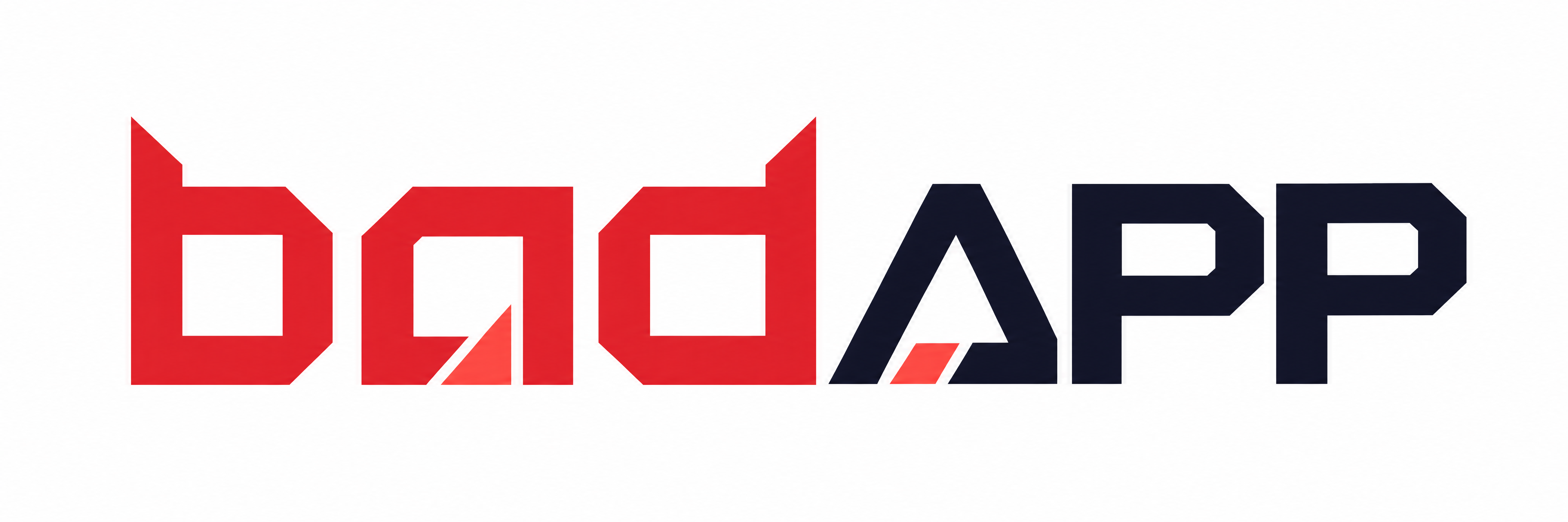
Primary Logo
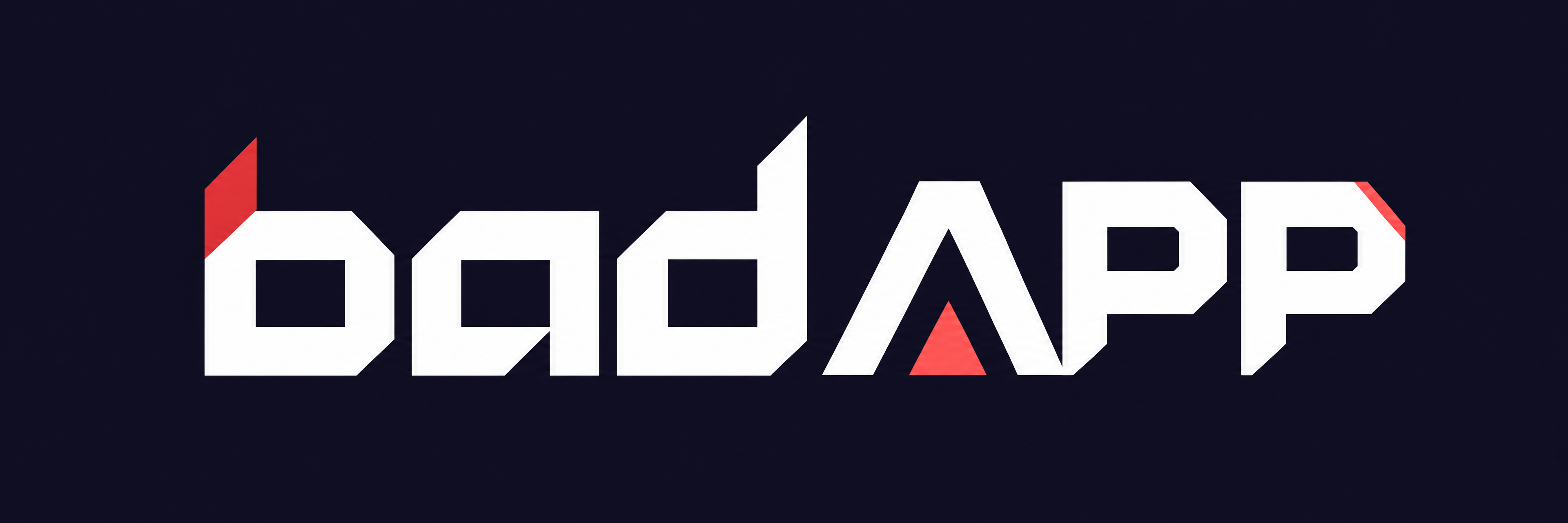
Dark Background
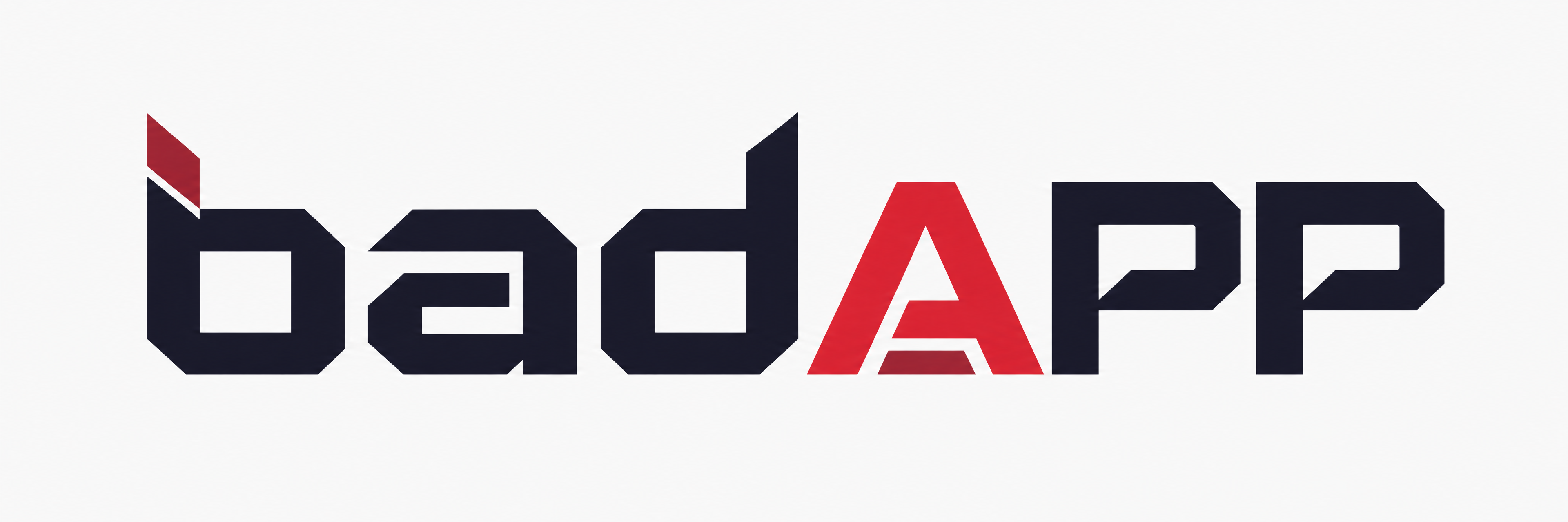
Light Background
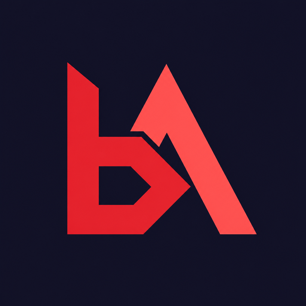
Icon / Favicon
Logo Usage Rules
Do's
- ✓ Maintain minimum clear space equal to the height of the "b"
- ✓ Use approved color variations only
- ✓ Ensure legibility at all sizes (min 24px digital)
- ✓ Use the icon mark for small-scale applications
Don'ts
- ✗ Stretch, skew, or rotate the logo
- ✗ Apply drop shadows or effects
- ✗ Place on busy or low-contrast backgrounds
- ✗ Change the logo colors or typeface
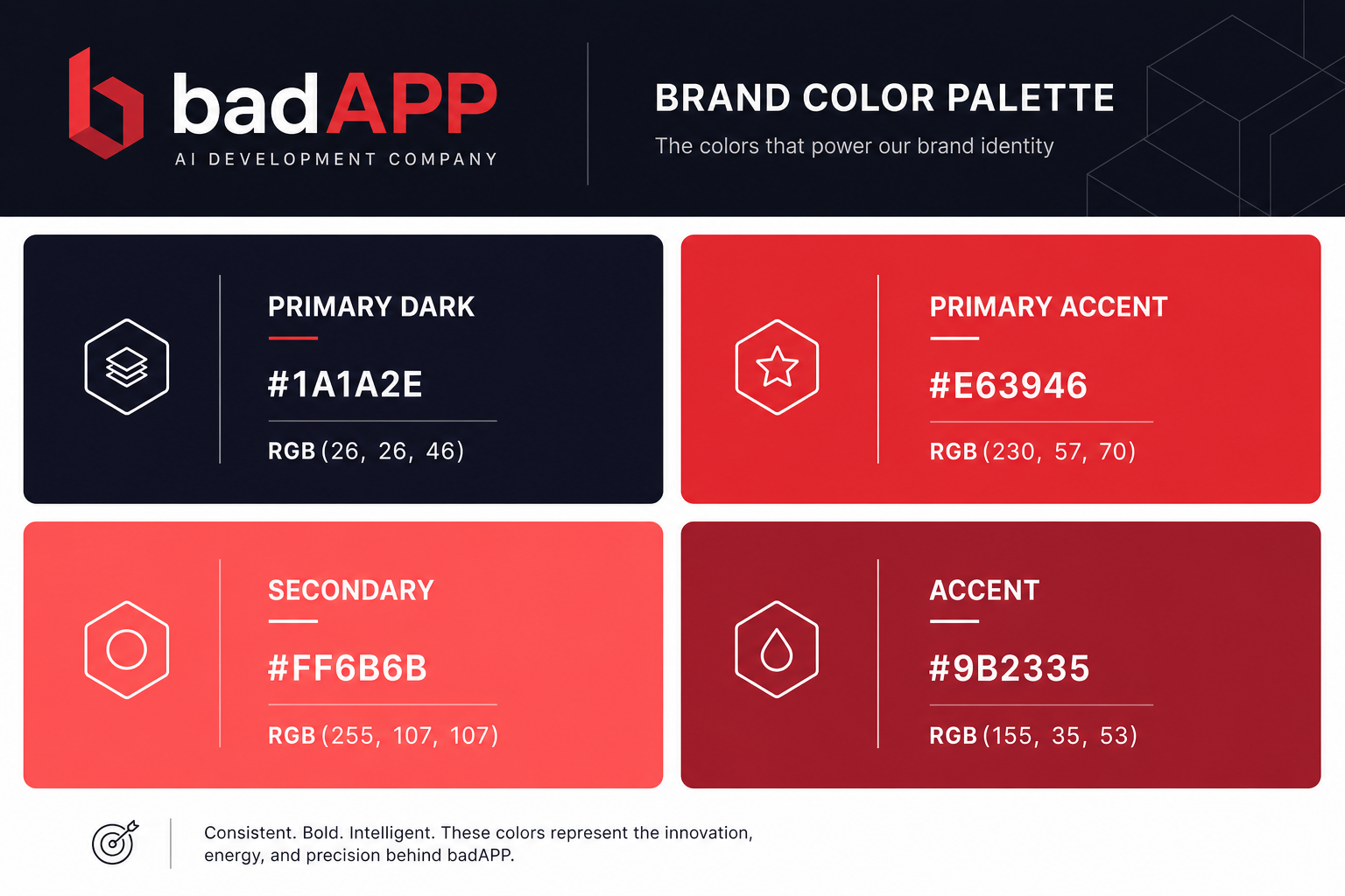
Color System
Color Palette
Our color palette balances authority with energy. Deep Charcoal grounds the brand while Crimson Red and Bright Coral ignite it.
Deep Charcoal
#1A1A2E
RGB 26, 26, 46
Primary backgrounds, headings, anchoring elements
Crimson Red
#E63946
RGB 230, 57, 70
CTAs, links, primary accent
Bright Coral
#FF6B6B
RGB 255, 107, 107
Highlights, gradients, secondary accent
Deep Burgundy
#9B2335
RGB 155, 35, 53
Innovation elements, tertiary accent
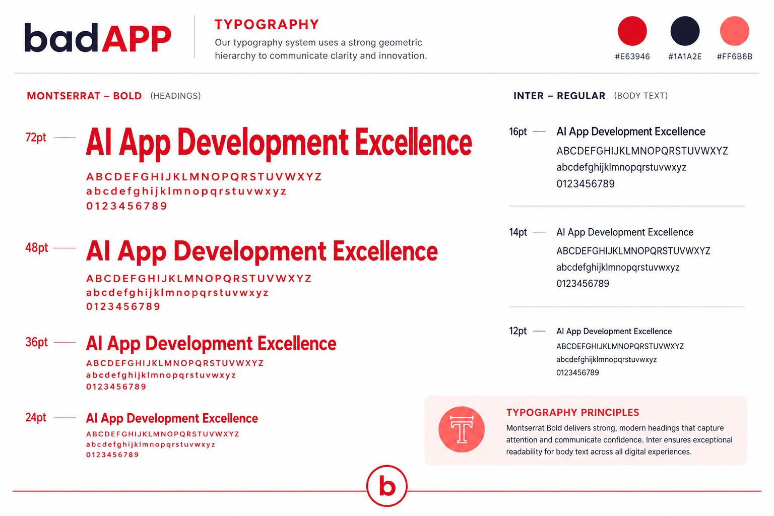
Type System
Typography
Two complementary typefaces form our typographic identity — Montserrat for impact, Inter for clarity.
Display Font
Montserrat
Used for headings, titles, and brand statements
Black 900
ExtraBold 800
Bold 700
SemiBold 600
Body Font
Inter
Used for body text, UI elements, and descriptions
Bold 700
SemiBold 600
Medium 500
Regular 400
Light 300
Print & Office
Business Collateral
Professional, branded materials for every business touchpoint.
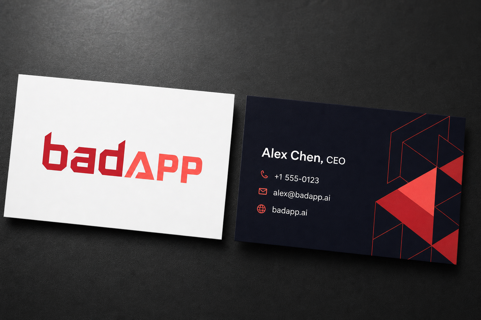
Business Card
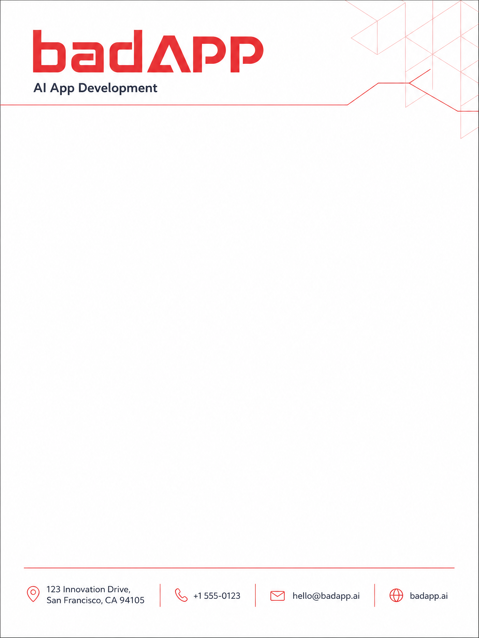
Letterhead
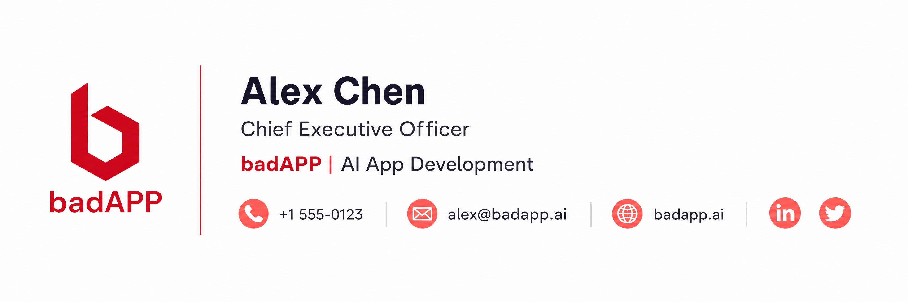
Email Signature
Online Presence
Digital Assets
Ready-to-use assets for social media, web, and digital platforms.
Social Media Profile
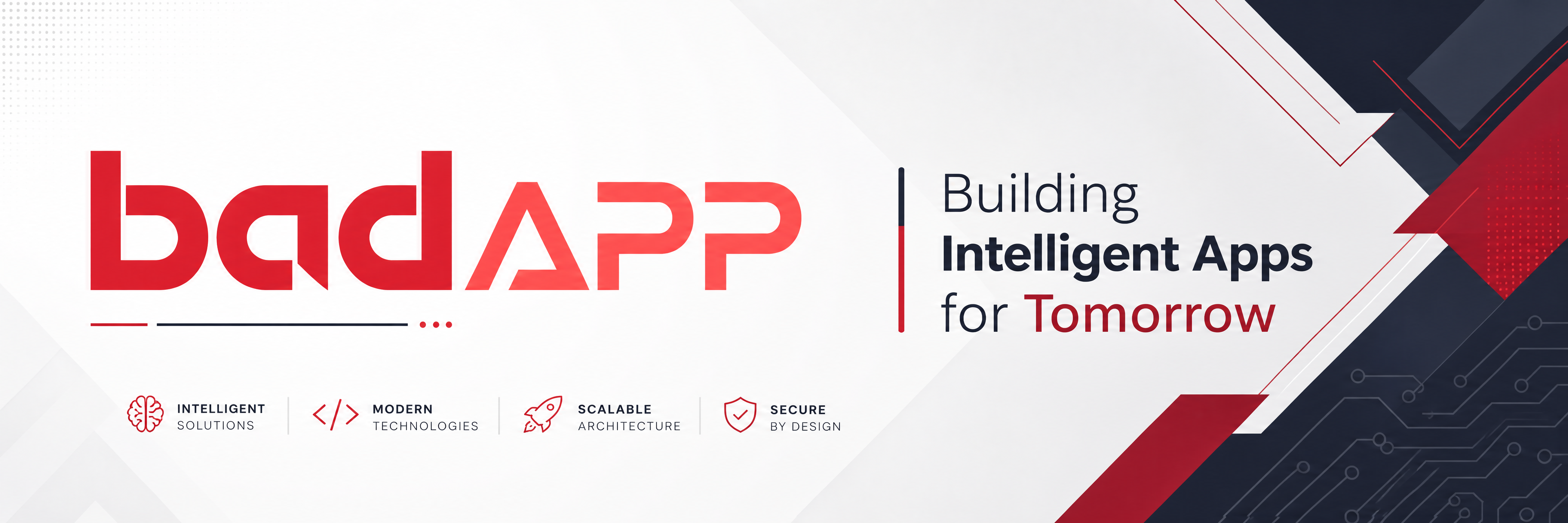
Social Media Banner
In Context
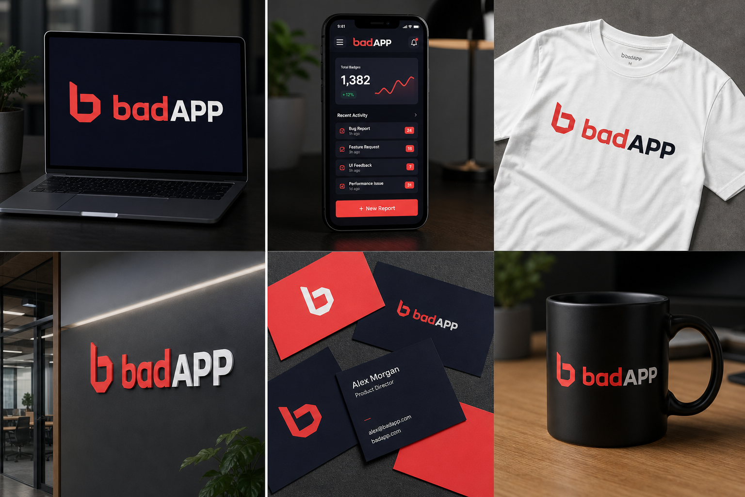
Brand in Action
See how the badAPP brand comes to life across real-world applications.
Get the Full Brand Kit
Download the complete brand guidelines PDF with all specifications, assets, and usage examples.
Download Brand Guidelines PDF